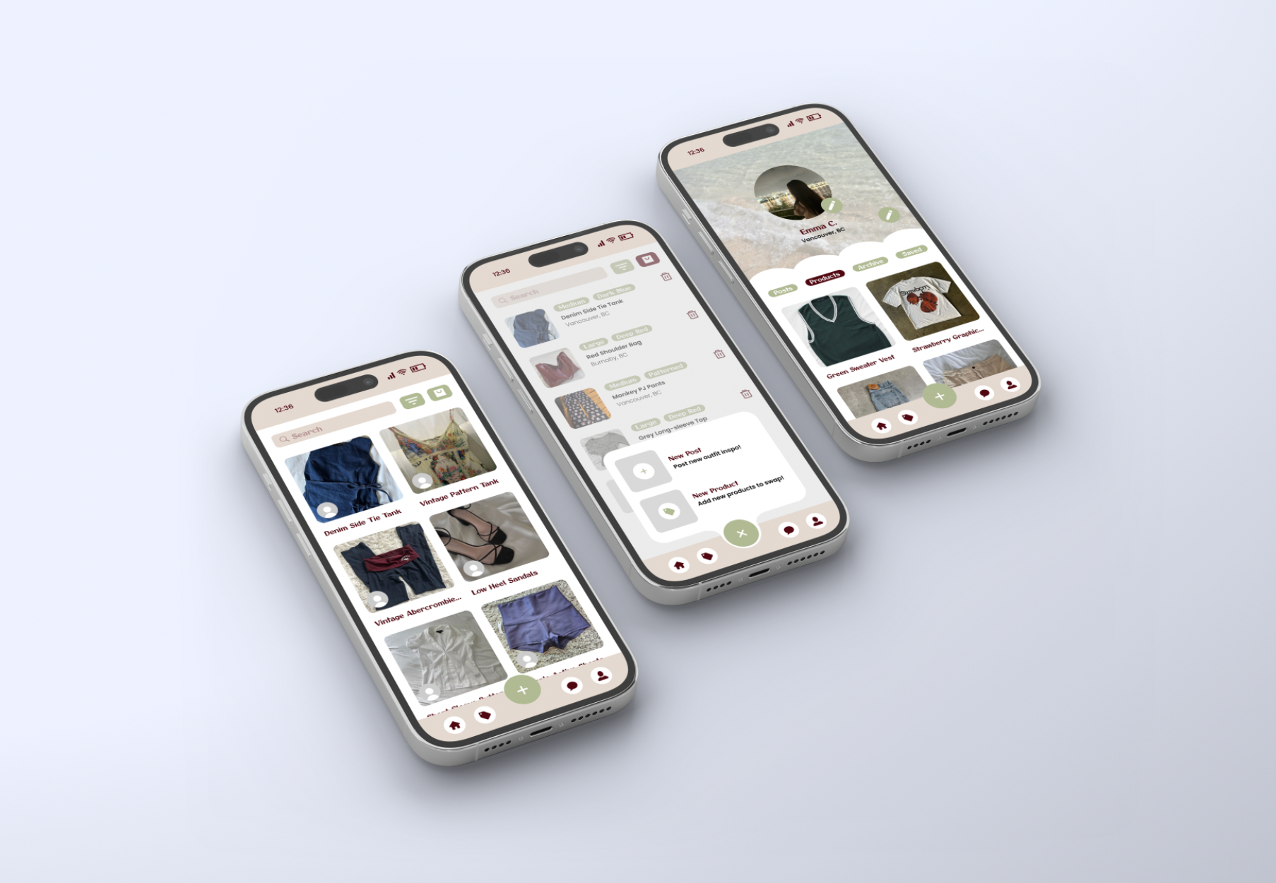
The Swapd mobile UX/UI design was a group project focused on creating an original concept and design. I took on the role of designing the app’s layout and creating high-fidelity mock-ups. Using Figma, I designed and prototyped 20 mobile screens. The app's concept was developed and brainstormed as a team, where we came up with a user-friendly app that helps people promotes clothing swaps with users nearby. The goal was to promote and encourage sustainability, and lower fast-fashion over consumption.
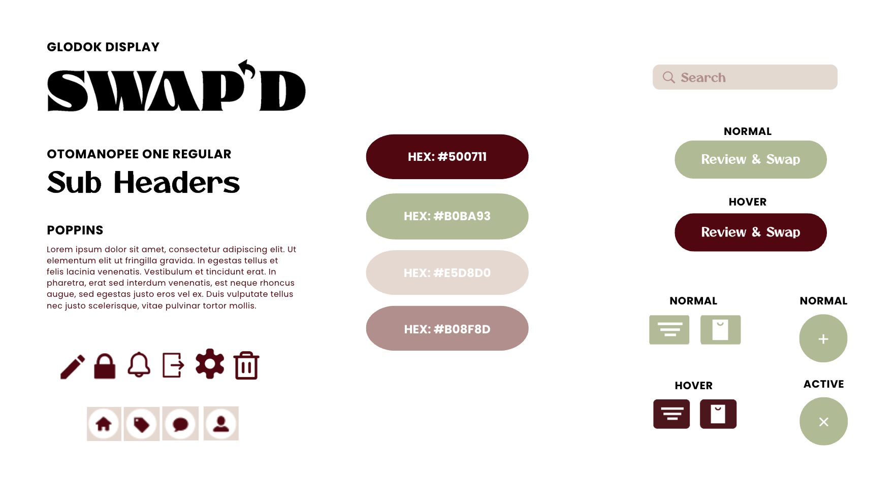
STYLE TILE
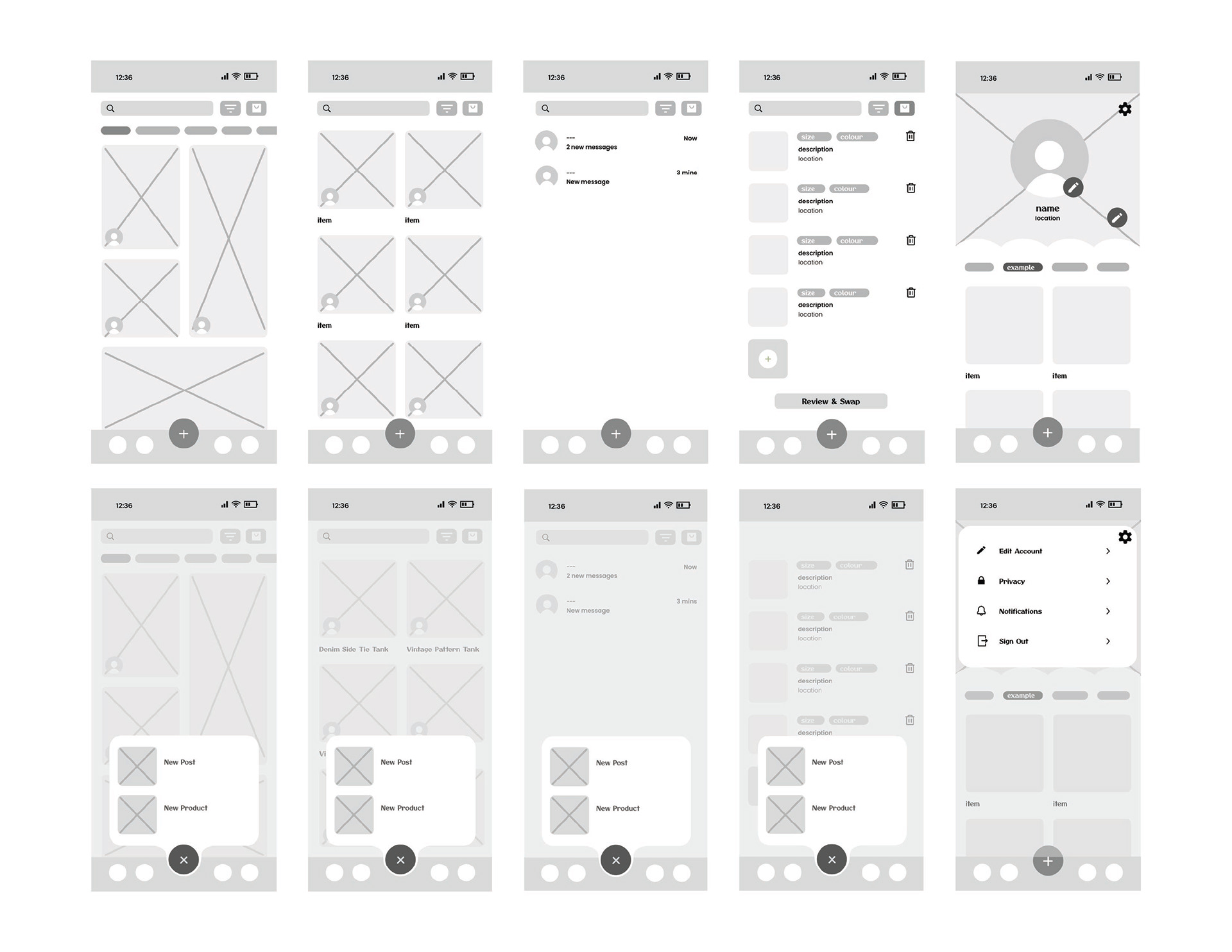
WIREFRAMES
Design Process
My primary goal for this design was to make sure the user experience felt simple and easy to navigate. I aimed for a creative look, without crowding the layout and causing confusion for the users. The buttons are fully functional, with clear indicators showing which page you're on or when you're switching between them. I started with a few key pages such as the landing page, then used prototyping to guide the rest of the user flow. This approach helped me build a familiar structure that aligns with more of a standard mobile app, while still allowing room to be creative.
ALL SCREENS
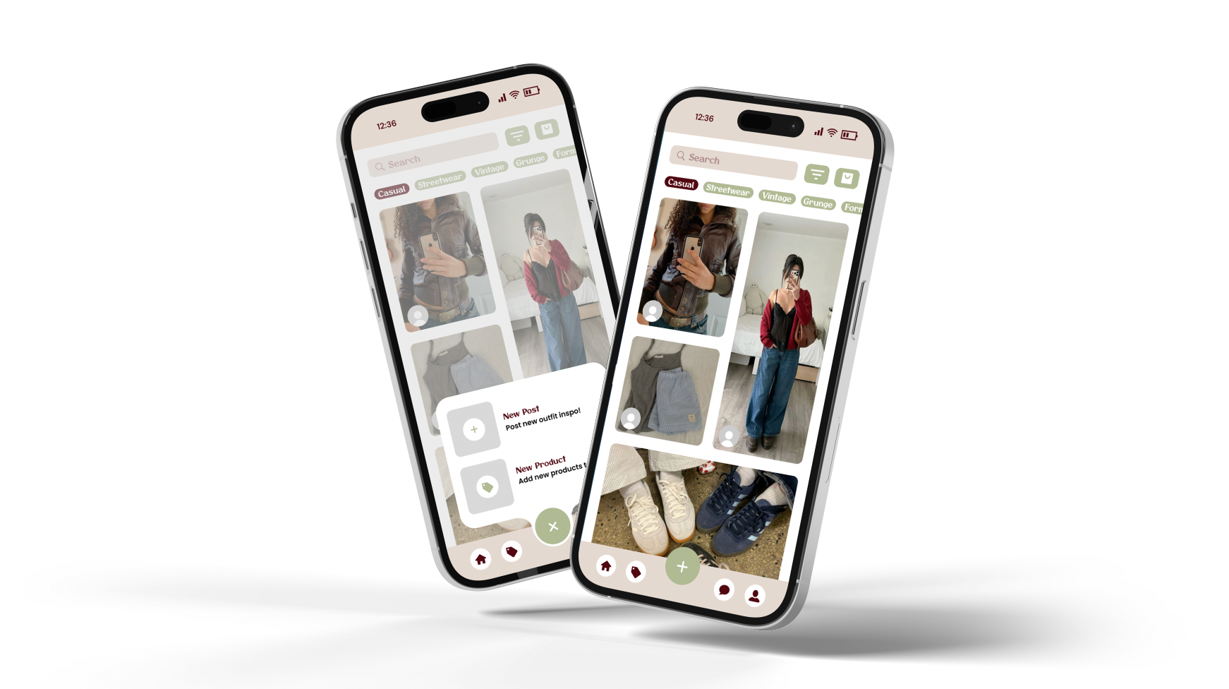
LANDING
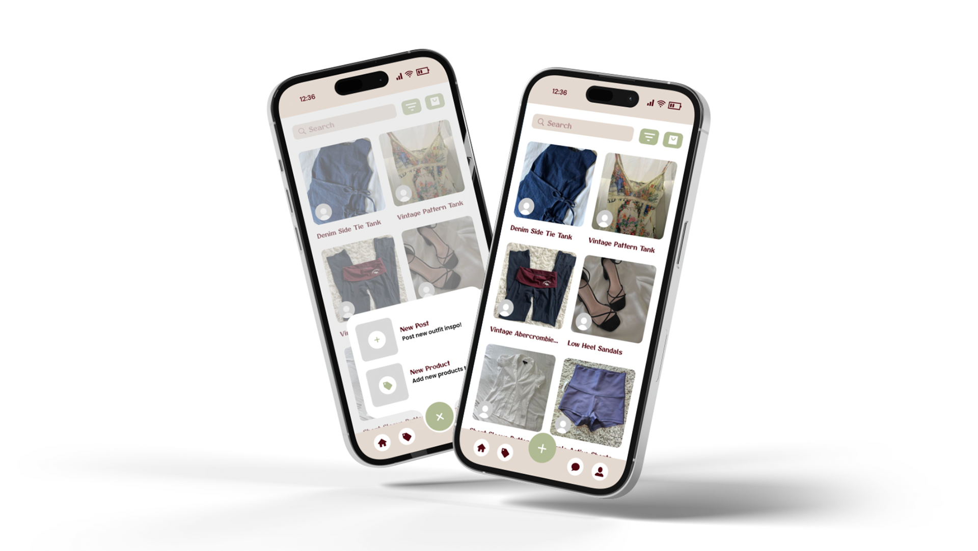
SWAP
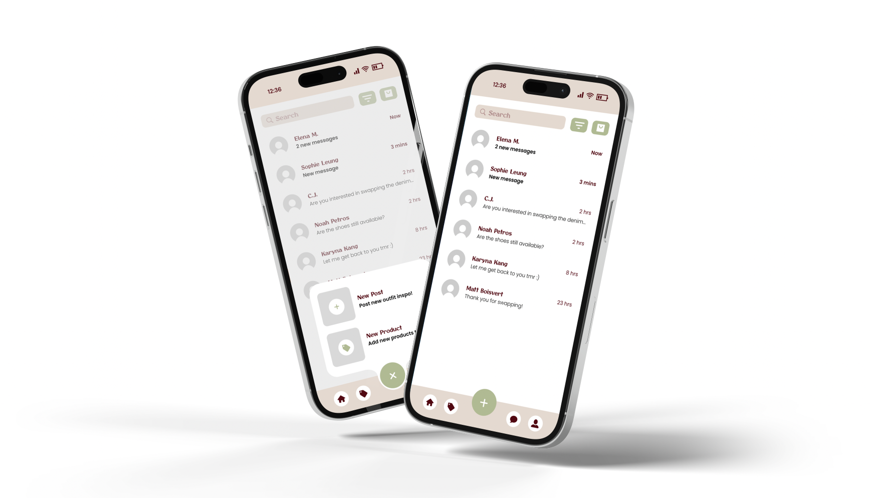
MESSAGES
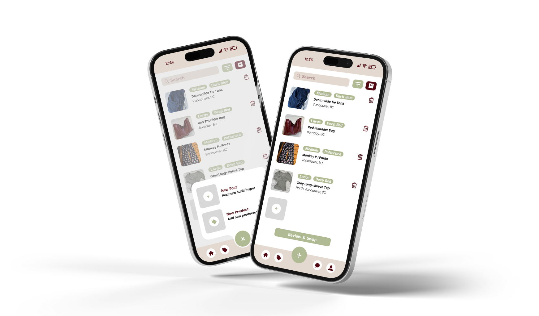
SWAP BAG
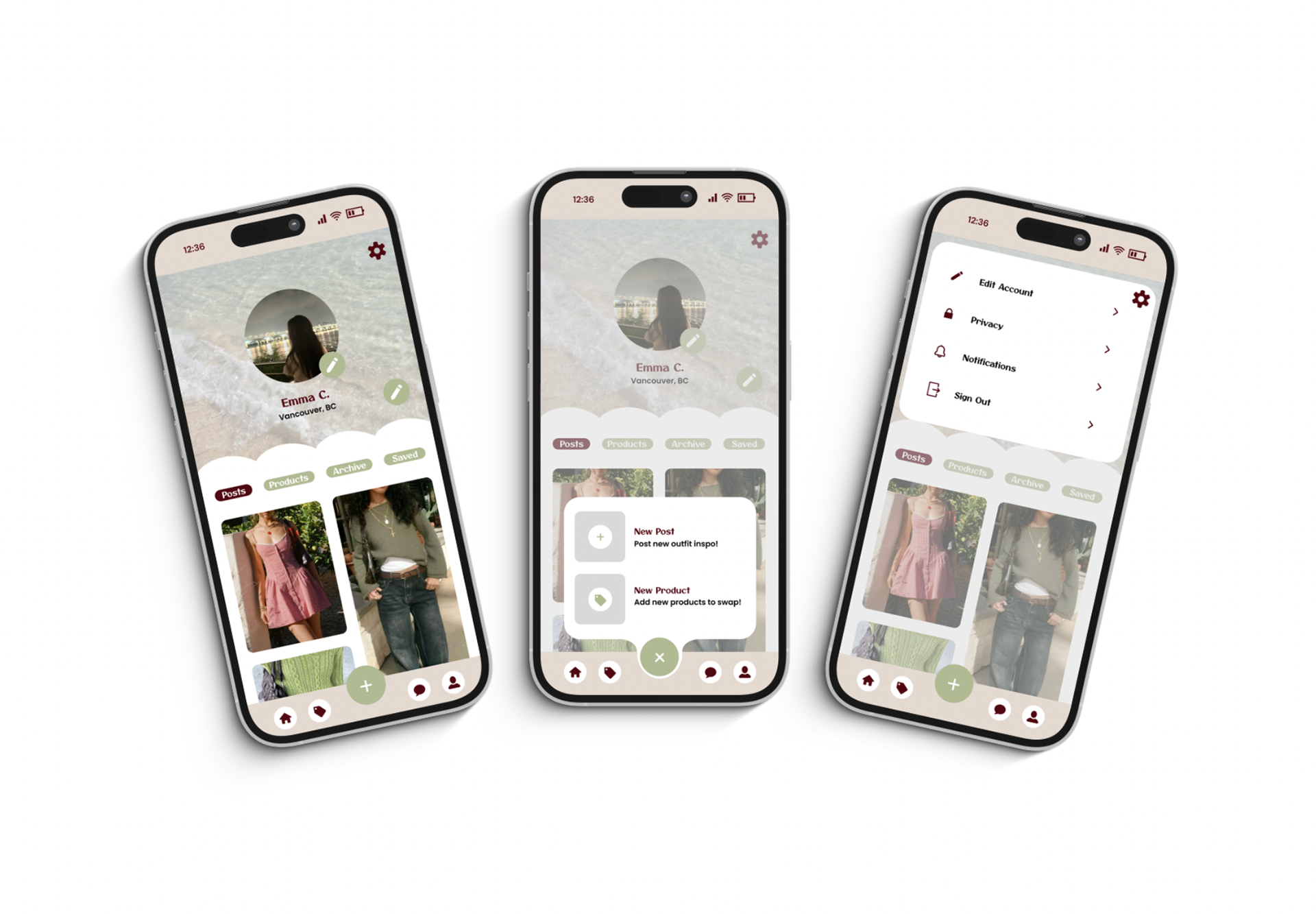
PROFILE - POST
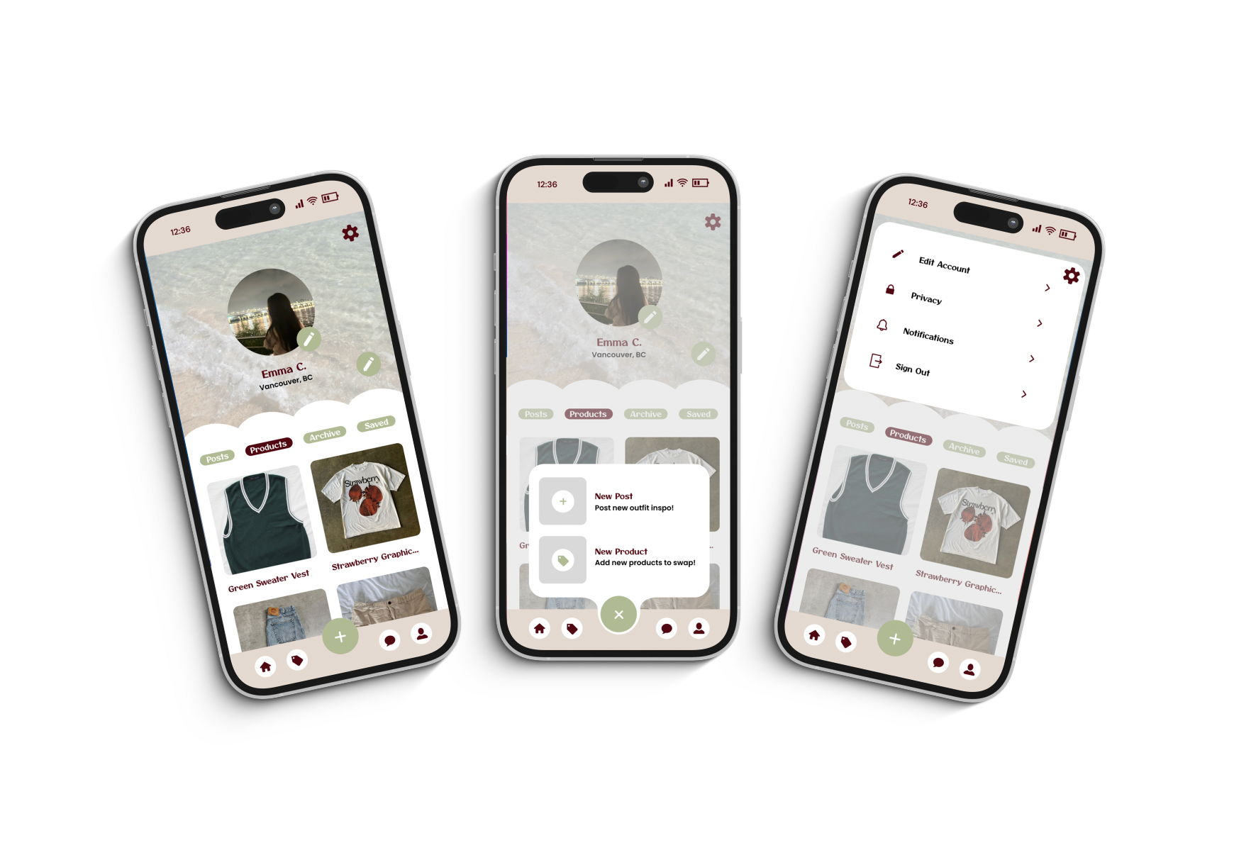
PROFILE - SWAP
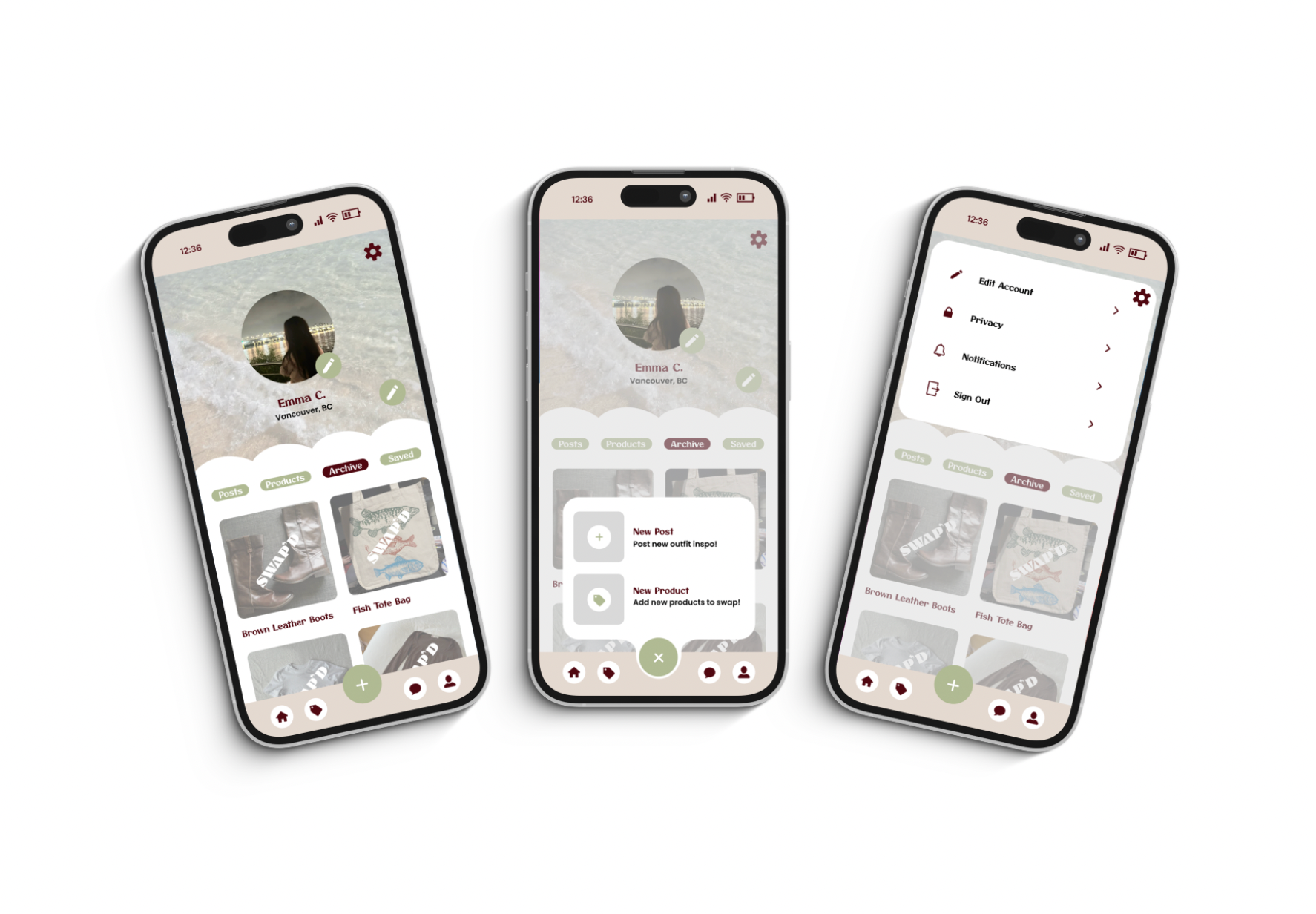
PROFILE - ARCHIVE
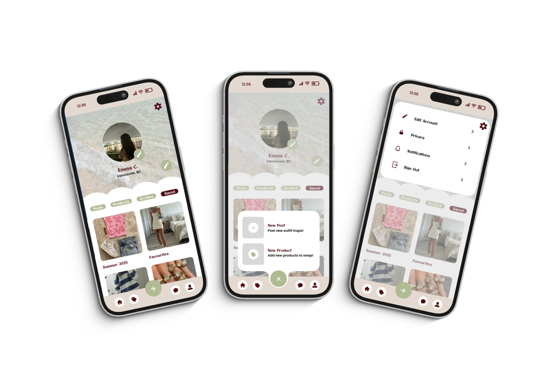
PROFILE - SAVED
Conclusion
I really enjoyed every part of working on this project, however, creating a cohesive layout with so many pages and moving parts was my biggest challenge. Given a second chance at this project, I would focus time on designing an entry page, as well as log in/sign up pages to tie the whole app together and incorporate the logo more it wasn’t used as much as it could have been.
Explore the prototyped design on Figma here.