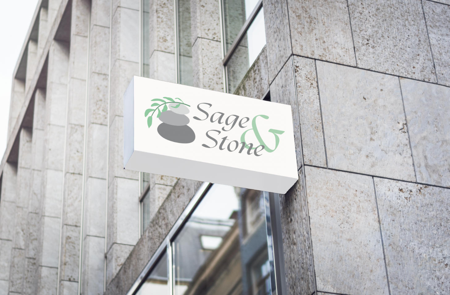
SIGNAGE
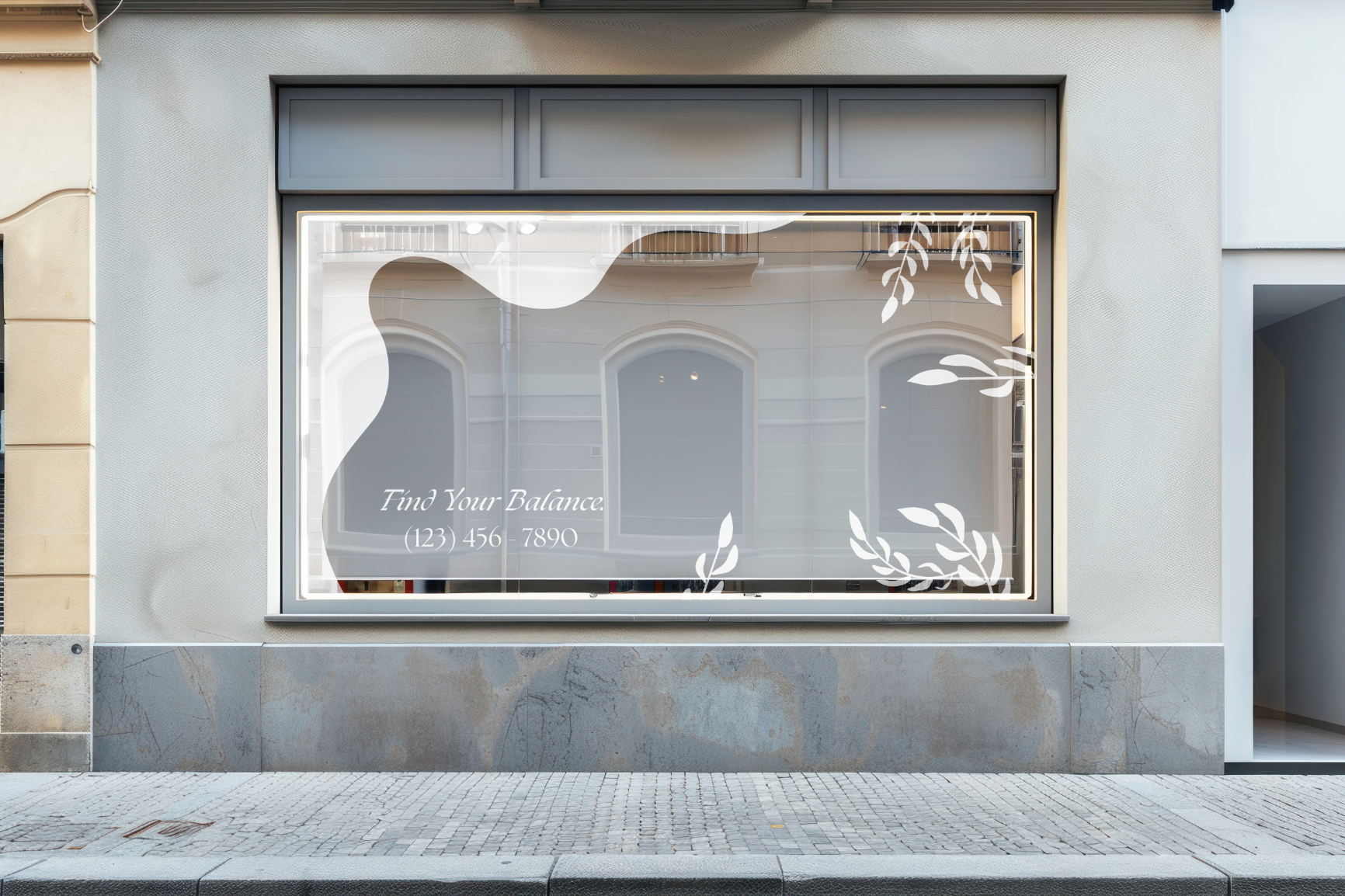
STOREFRONT
COLOUR PALETTE
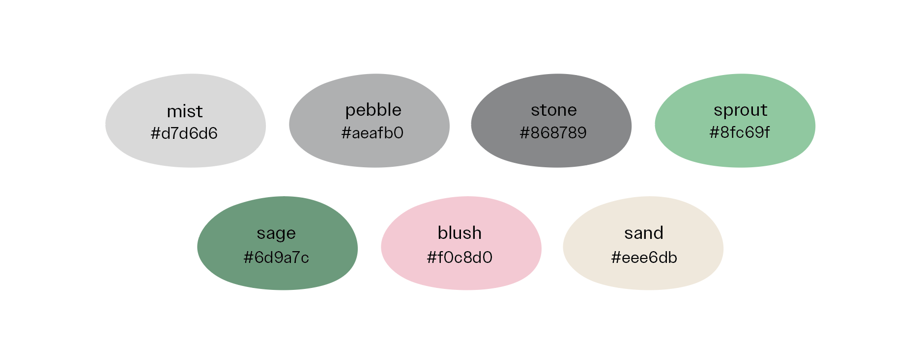
This colour palette represents the brand well. The three greys along with the two greens are meaningfully used in the logo - greys representing the stones, and greens representing the sage. The colours "blush" and "sand" are secondary colours and help tie in the rest of the brand identity and collateral in a soothing fashion.
BRAND COLLATERAL
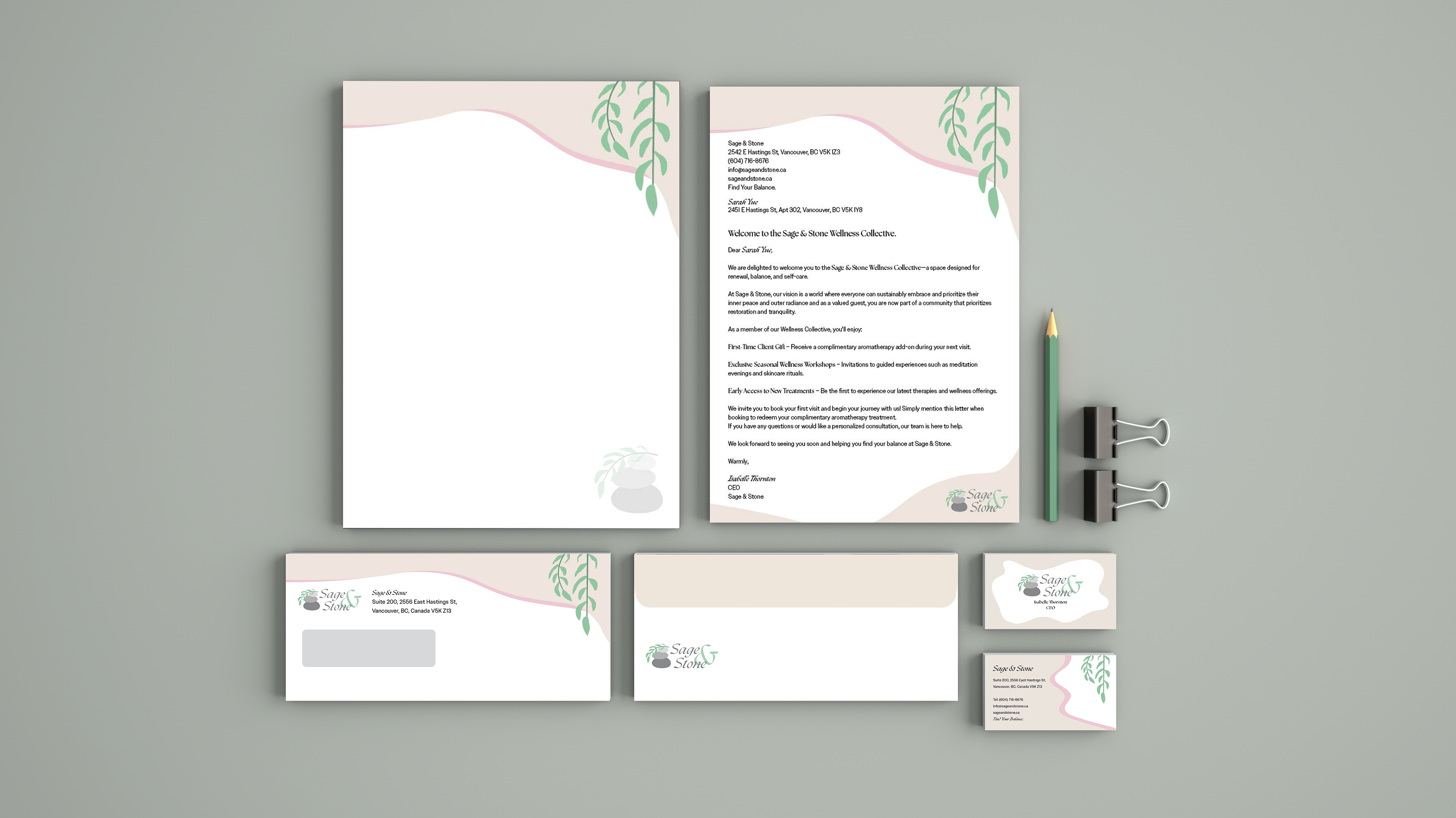
STATIONARY
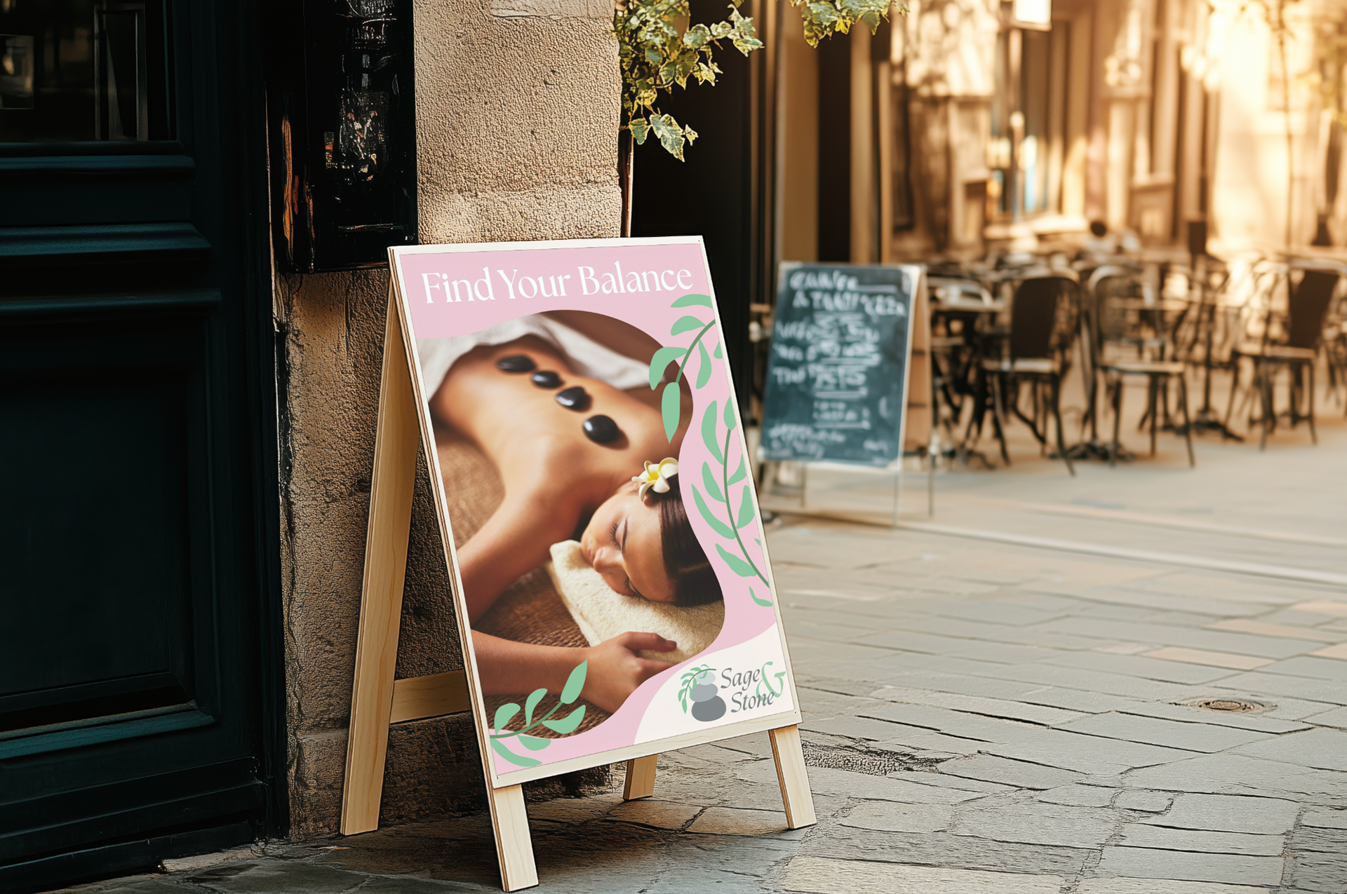
ADVERTISEMENT
Stationary & Advertisement
The stationary package includes the standard letterhead and second page, as well as an envelope and business cards. Each piece of collateral reflects Sage & Stone's brand identity, making full use of the colour palette and incorporating the graphic elements used in the store's signage and storefront.
The same approach applies to the advertisement: the tagline is clear and easy to read for people passing by, while an image of one of the spa’s services helps attract potential customers to come in and experience it for themselves.
Conclusion
I found this brand identity project to be very interesting as so many different elements go into the process. I found making sure everything was a cohesive identity to be the most challenging part. With more time, I might rethink my logo as well, as I found that the colours used created some additional challenges when creating the brand collateral.