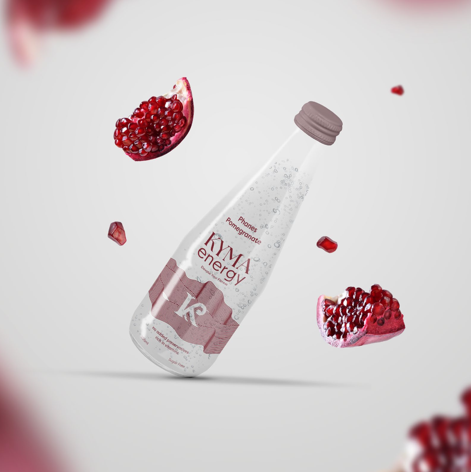
This packaging design group project focused on designing and branding an energy drink. As a team, we decided on having a Greek-inspired theme, paired with the concept of clean and natural ingredients which is translated through the use of glass packaging. I contributed by participating in group discussions/research, sketching design concepts, and creating the final two ad concepts using Photoshop.
LOGO
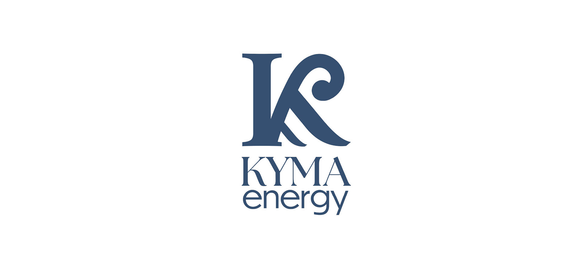
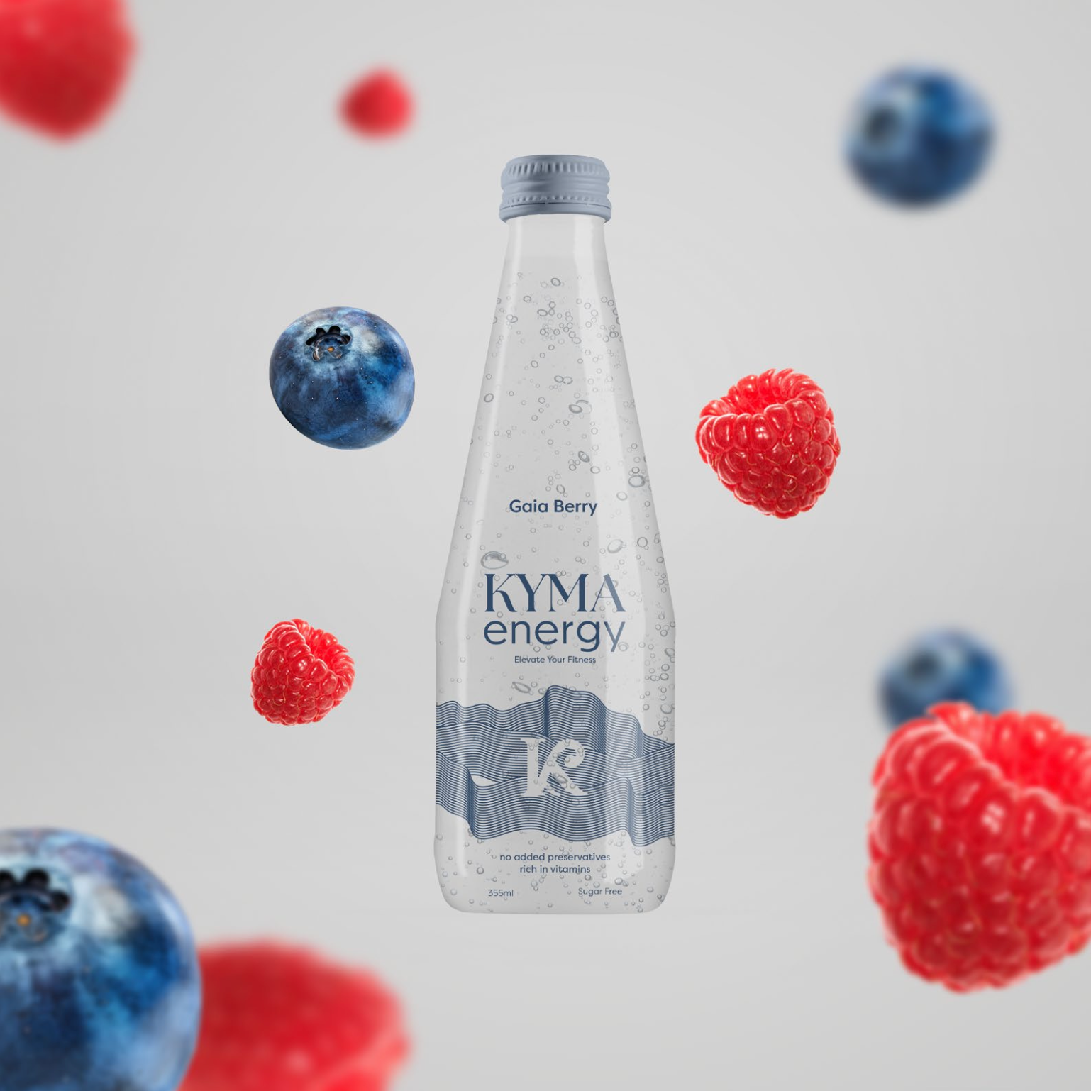
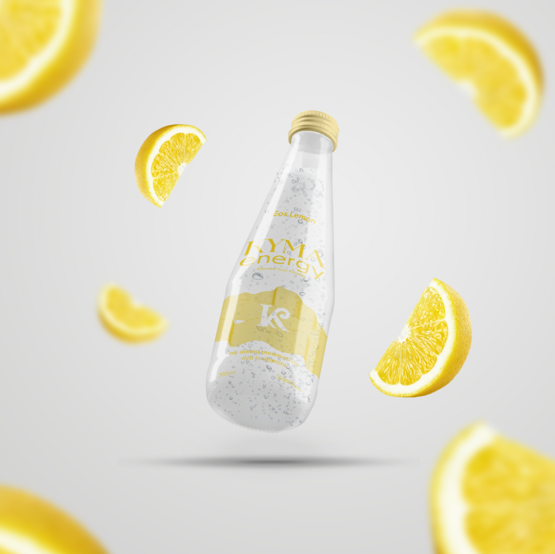
The bold letter “K” is the main part of the Kyma logo, and represents the brand name. The vertical stem of the “K” resembles a Greek column, which pays homage to Kyma’s Greek roots. The curved stroke within the “K” symbolizes the motion of the ocean's waves (“κύμα” meaning “wave”).
AD CONCEPTS
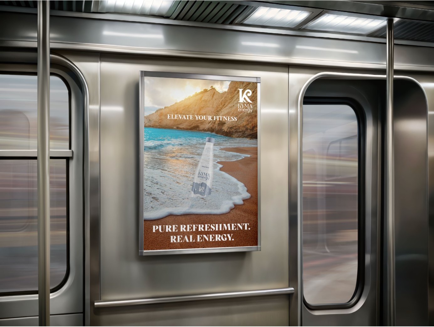
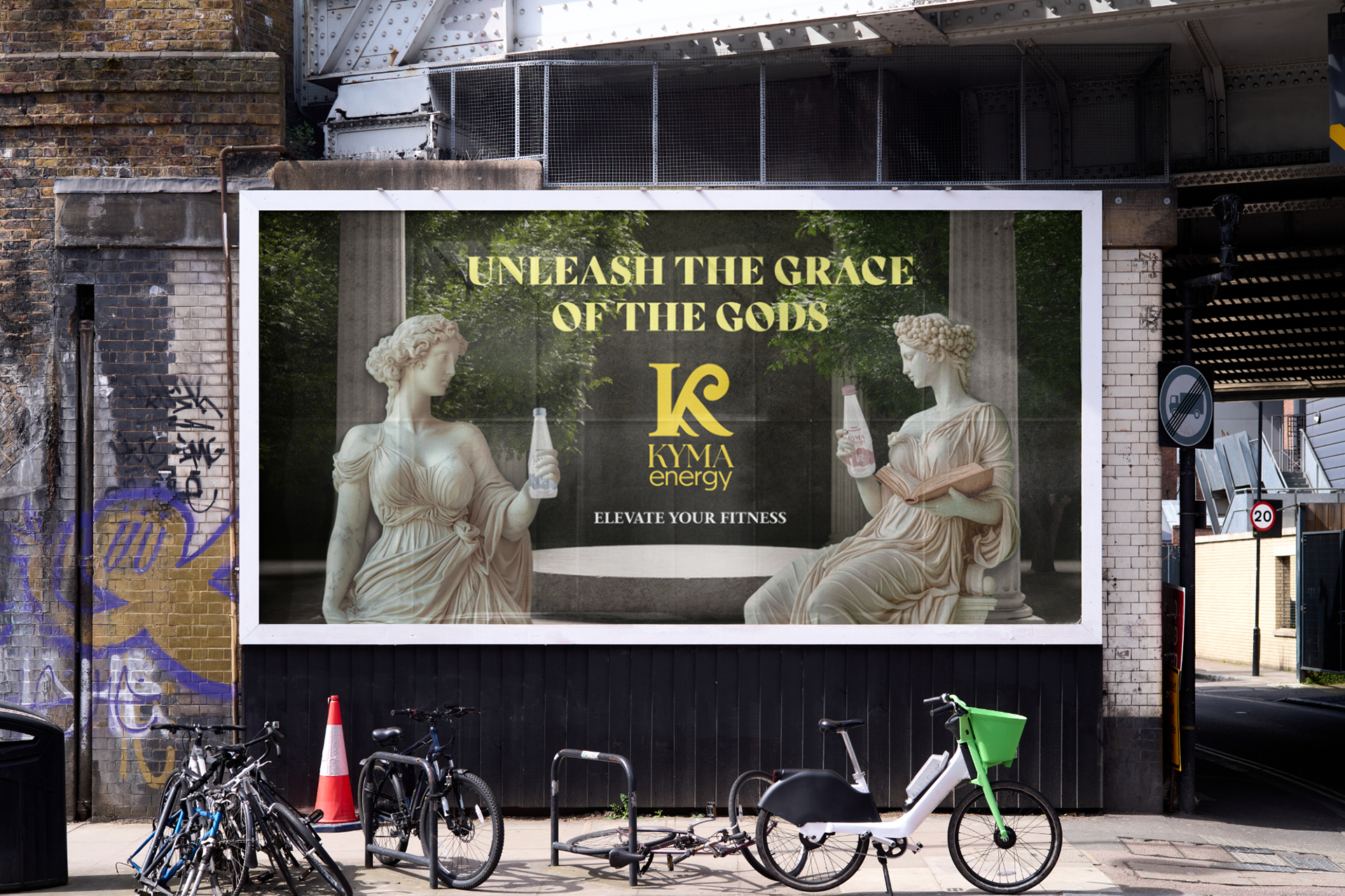
The two ad concepts are quite visually different, however they tie in to the brand's Greek theme well. The first advertisement conveys a more refreshing theme, and features a Greek beach with the energy drink partially buried in the sand. The second advertisement is more bold and attention-grabbing, and has a playful undertone as two Greek statues are holding the products.
Conclusion
I found this project to be quite difficult, mostly due to the fact that our product packaging is glass. This decision was made due to the research done relating to our target audience and market, however it became a challenge when designing the labels. With a can, there would be more opportunities for creativity with the overall designs and colours used, however I think that with the limited time and elements, it turned out well.